
This site, as a set of proofs
Earlier this month, The Leverage hosted a live build event around using new tools to launch personal websites. I participated, and took it as an opportunity to give this site a fresh look and feel. The new design is still print-inspired, but the intent shifted: less book-ish, more proof-ish. This post is all about the new look.

From book to proof
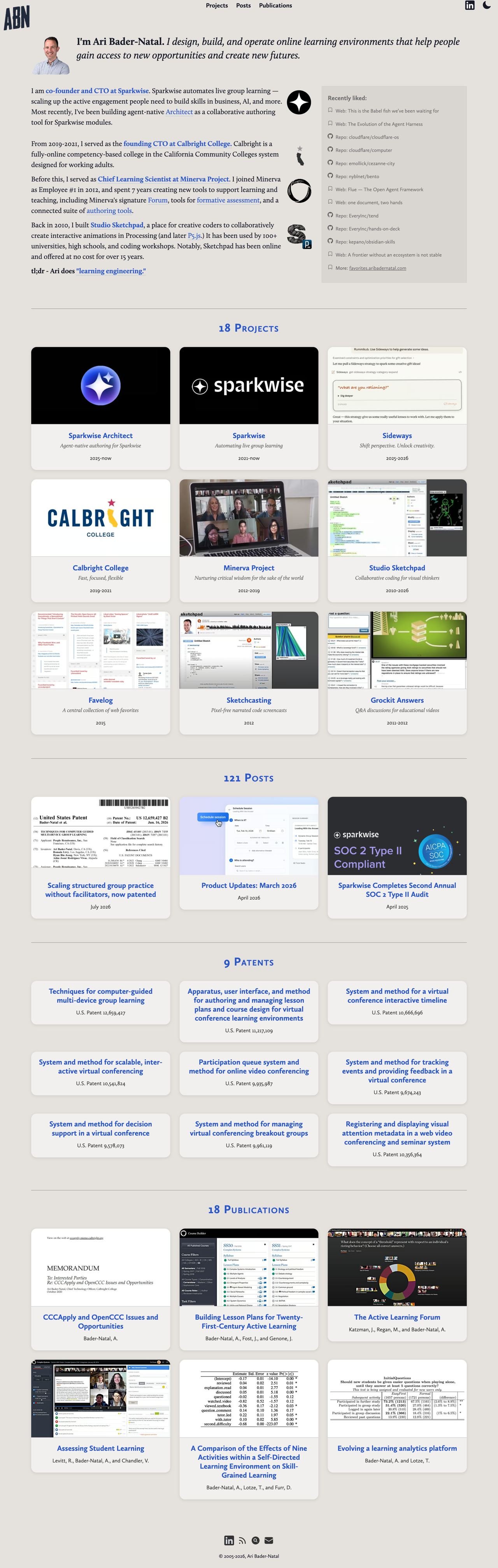
This is the third redesign I have written up here. The 2015 edition came out of an IndieWeb Homebrew Website Club meetup: everything I had made or written gathered onto one static site, with the table layouts finally gone. The 2022 pass was visual, done alongside Nate Kadlac’s 80/20 design challenge. That is when the site went to Calluna, and it is the design in the left-hand screenshot above. Each of those was still, at heart, a page in a book.
The previous design borrowed from the book: a bound page, running text, a spine you moved along chapter by chapter. A book is a finished thing. A website is not.
A proof is the sheet that comes off the press before the book exists, trimmed to size but still carrying the marks that let a printer check it: crop marks at the corners, registration targets on the edges, a color bar, a slug with the sheet number and dimensions. For a site that is mostly a record of work, that felt like the better metaphor.
The idea came about sideways. In 2011, I redesigned the Studio Sketchpad gallery after spreading a deck of printed mini-cards across a table, each one featuring with a snippet of an interactive sketch someone had made in the studio. I felt like the cards showed off the sketches better than the current website did, so I redesigned the site around the minicard designs. I wrote it up at the time. At the Leverage event this month, I started sketching a photobook-inspired layout starting from those same cards, and one version of the comp presented each spread as a printer’s proof rather than a finished page. It was meant as a rendering device for the plates, but I liked it enough to use it to frame the entire site redesign. Fifteen years apart, but essentially the same idea: a stack of paper on a table, with a website redesigned to match.
Type and color
The text face is still Calluna, by Jos Buivenga. I first saw Calluna on Cedric Chin’s long-form posts on Commoncog and loved the look. First added here in 2022 and kept it in this redesign.
The color palette also kept from the 80/20 design challenge from 2022. Now it’s visible in the printer’s marks around each sheet. (Click on the colors for a small easter egg.)
What still needs work
On the new homepage is the one sheet that still looks like it came from somewhere else, and it did: the Favorites sheet contains content pulled from a separate WordPress site that is a self-updating archive of everything I star, save, or like around the web. For the past 10 years, favelog.aribadernatal.com has been dutifully auto-collecting for me. I still find this useful, but I no longer need to run a full-blown Wordpress CMS to power it. When I next have a chance, I’ll retire the Cloudron-hosted WordPress instance and replace it with a custom-built replacement.